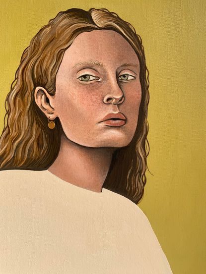
Aoife - Painting Process
- Dora Furnival
- Jun 26, 2022
- 8 min read

Aoife is the first painting I've done in over a year, a year of working almost completely digitally. After a trip to an open artists studios event in my hometown, seeing all of the grubby, messy, textural, playful studio spaces with equally grubby, messy, playful artists sitting inside them, I felt an urge to get painting again.
I've always enjoyed painting faces and I've always liked to challenge myself to make them as realistic as possible. Perhaps this is something I picked up in school, we are taught this very binary idea:
Painting or Drawing that looks like a realistic version of the subject = Good
Painting or Drawing that looks less realistic, less accurate = Bad
I wanted to really challenge myself to go slowly with this one, I've noticed there's a point with every painting that I do when it looks on the edge of finished, the unfinished elements sing and it bring it dimension, playfulness and life. However, at this point, I get the little voice telling me 'Yeah, yeah, you like it now, but it's not finished. You have to finish it! That unblended brushstroke, that area of block colour, you haven't even painted every single eyelash!'
There are elements of detail I really enjoy doing, like hair and skin texture. But this time, rather than a realistic, photolike portrait, I want to let it be a painting, otherwise, why not just have a photo in the first place? I want to let it be a painting, enjoy adding elements of detail but keep an eye out for any happy accidents, unfinished elements that make it sing. I want to find something new, something fresh and relax into the process with less of the end goal in mind.
Reference

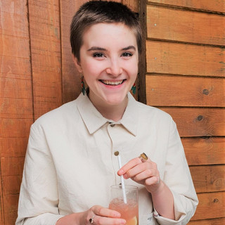
As always, my first step is finding a reference. I'm currently working from photographs, for lots of reasons but mostly space, time and money.
I have a Pinterest board full of faces that I'll pluck one from. Unless I am painting someone specifically, I'll just use the reference as a rough guide and, as I paint, their face will develop and change shape, becoming someone slightly different. The downside of finding references on Pinterest is that its near impossible sometimes to trace the image back to its original creator.
I was drawn to this image because of her softness, her light eyebrows and eyelashes and the subtle variations of her skin tone. The image itself compositionally is what I like to paint too, that slight side-on angle with one side of the face in shadow - it offers rich areas of contrast and depth.
Sketching

I decided to use a clear-primed, linen canvas for this painting, going from the off with that idea of welcoming the unfinished qualities that I know I've liked in previous paintings. Whenever I have painted on linen canvases, I always love the point where the face is painted but the linen background is still exposed. Though, whenever I have felt this, I've always painted the background in not too long after. This time, I'm going to leave it for as long as possible and see, in the end, if the exposed linen is something I want to keep.
I drew out the face using the grid method which has always been my go-to, with some of my next paintings, I might challenge myself to go without the grid and see how I get on just sketching from the photo, I wonder sometimes if the grid feels a bit too safe, rigid and comfortable and it might be nice to have a go without it.
I sketch out the main shapes and add some shadow points, I never do too much at this stage because it's just a guide and there's no point adding too much detail because most of it will just painted over and hidden almost immediately.
Adding Contrasts

This was a new step in the process for me, usually once the sketch was done I'd go straight in with a mid-skin stone layer and begin working in sections. This would work fine, sometimes it was hard to blend the sections together and it could feel a little cumbersome. I'd see other artists using this stage, using a monochromatic wash to add shadows so I wanted to try it out.
This time, going back to what I wrote at the start, I wanted it to feel more painterly from the very start. When you're copying a photograph, it is easy to work in sections because your subject is a flat, unchanging image - you don't really need to think about the face as one whole piece, like you would if you painted from life. So I wanted to rethink my first step and try to work on the face as a whole from the start.

The paint was an ultramarine-brown earth mix, used in varying thicknesses of washes to create depth and help to map out the dimensions of the face.
This new step ended up being really beneficial for me, it worked so well as a guide for painting, allowing me to apply the next layers of paint more confidently and purposefully. In the end, I think it also helped to create a richer, deeper base for the areas of shadow. I will definitely be taking this step forward and bringing it into my process.

The First Layers - Colour Blocking
When thinking about how I was going to start adding in the colours, I knew I wanted to avoid the usual approach of working on perfectly painted individual sections, that I then had to clunkily try to blend together. I really enjoyed the previous step of mapping out the contrast on the face, so I wanted to get that forward and try to map out the colours of the face, not worrying about blending at all at this stage.
It was during this stage that I realised just how useful the previous step was, the shadows were already there for me now, almost like an outline to guide me with the mid-tones and highlights, especially around the eyes and nose.
When it came to colour mixing I used only white, ultramarine, a warm yellow, cadmium red and brown earth. I always try to avoid using black as much as possible, I was told once that pure black deadens any shadows because no shadow is actually ever just black in real life, its a mixture of so many tones and colours.
This was definitely a moment of really enjoying how unfinished it looked, especially the right image. I love the painterly, unblended, purposeful brushstrokes. Part of me really wanted to leave it like this, but I think, especially as someone who just enjoys painting so much, it was more that I just didn't want to stop at this point! Perhaps with a later painting I might keep this painterly, blocky, 'brushstrokey' finish for longer.


At this point there were a couple of happy accidents that I was actually really loving. Firstly I had just blocked out the hair in this pale yellow colour and I ended up really like the contrast of the flat, graphic hair against the detailed face. I was also loving the dark outlines that had appeared on the face, around the eyes, nose and on the jaw especially. I think it was a combination of the very first washy stage not being covered, and also the fact I hadn't blended them out yet. I knew I definitely wanted to keep those darker, crisp, sharp lines in. This really surprised me because with past paintings, I would see those and immediately try to blend them out.
I also really loved the bold, vivid pink patch on her cheek and around the nose. Looking back, I wish I had kept that.


In this photo I had blended the skin much more, but still keep the crisp, dark, lines. I noticed she was looking really cold and grey, my colour-mixing had gone a bit off and I think I might have
been using bluer, dirtier colours. I made a warm wash and really lightly applied it to the face and it was amazing just how much of an immediate difference it made.
I really want to take more time and be more thoughtful with my colour mixing with my next painting, and really make sure the colours are right before they go on. Hopefully then I won't need to do any colour correcting washes like this.
Overworked

I decided to paint one day, when I probably shouldn't have done. I was feel stressed, anxious and almost forced myself to do it because I felt guilty for not doing it. The result was this over-worked, clunky, clumsy, over-painted face. I was absolutely gutted and so annoyed with myself for, in my eyes, 'ruining it'. This was definitely a lesson for me, not to force myself to paint out of guilt restlessness.
I decided to take a break, I even turned her away to face the wall so I wouldn't be constantly looking at her. Looking back, of course, I managed to fix it but I had to work hard and add in lots of unnecessary layers

I was back on track and SO happy with how her skin and face looked at this point. The speckled cheeks, the blue shadows in her eyes and the end of the nose looks so crisp, effortless and smooth. Honestly, on reflection, I kind of wish I'd stopped with her skin there. The eyes, the simplicity, the form, I just feel really happy with how she looks here. She looks fresh, clean, bold. This is definitely a note for future Dora to slow down at this stage!
I decided she needed a bit of grounding compositionally so began to mark out a torso and shoulders.
Hair

As much as I loved the stylised, block of yellow hair, I decided to paint the hair in the end. Honestly, I think it was purely for selfish reasons because I just really enjoy painting hair!
I began roughly blocking in the colours and, honestly, I was a bit worried. I knew if I stuck with it that it would probably end up okay, but the first couple of layers (above) looked really ropey. I was struggling to get the fluidity of the lines needed for hair, so I went out and bought a thing, long, rigger brush which really helped. Looking back, I think I'll try to simplify the hair in the next paintings, use fewer colours, layers etc.

Background

I chose a linen canvas in order to leave the linen exposed, to keep with my original plan to enjoy the unfinished elements, but towards the end I got the feeling that she needed a background. She had a graphic, strong quality to her and the block colour of her torso felt like it needed balancing with a block colour background. Using procreate I tried out a few background colours and these were the 4 I was most keen on. I liked that the orange/red background brought out the pinks in her skintone and the yellow did the same for her hair, but in the end I went for the green, gold, ochre colour. This was partly because it is just one of my favourite colours of all time, but also it complemented her hair and eyes perfectly and it just felt right for her.
I added a little gold earring to give her a little more personality and to add some interest to that area, which was otherwise just dark shadow beneath her hair, a layer of matte varnish and then she was finished!


What was successful?
The unblended, stylised dark lines on the face contrasted with the blended, textural, realistic skin tones. I absolutely love this and the balance between realism and stylised it creates.
The block colour t-shirt and background, I think it adds a freshness and helps the face to remain the key focal point.
Her eyes, I can't quite put my finger on it but I just love her eyes.
The freckled, mottled skin texture on her cheeks.
Her nose has a lovely, gestural, graphic qualities to it, yet it looks neat and concisely painted.
What to do differently?
The hair. I think her hair, although it has a lovely depth, is overcomplicated and a little muddy. I think this is because I had to do a wash over it to bring it together. I think with the next portrait I want to limit the colours used in the hair, keeping the gestural brushstrokes, but perhaps less of them.
I want to take more time and care with accurate colour mixing so I don't have to do any washes to correct the colours.
I will go much more slowly and try to be much more mindful when painting, so I don't overwork it like I did with this one.
Overall, I am so happy with how Aoife has turned out. She feels different, new, fresh, exciting and playful. There is a real strength to her and I feel like I've done a good job of being open to new, accidental, stylistic features but still allowed myself to paint a rich, detailed portrait.

Comments