Rhian - Painting Process
- Dora Furnival
- Aug 3, 2022
- 6 min read

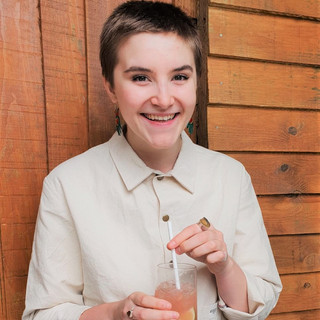
Rhian is the first in a series of portraits of people who have very kindly 'donated' their faces to me, I wanted to work on a more varied range of faces to practice my skills on and I decided to start with Rhian as I thought she would fit well on this circular canvas I had.
Sketching

I began in the same way as usual, using the grid method to sketch out from the photograph.
I thought about trying to draw by eye, without the grid, but honestly, I just wanted to get it on the canvas as straightforwardly as possible because I was excited to get painting!
I have since done a bit of drawing practice without the grid (with varying degrees of success...) which I want to write about soon.
First Layers

I forgot to take as many process photos as I would've liked, but I started in much the same way as before with the first layers of tonal washes.
I then moved onto colour mapping, starting with larger, broader, unblended strokes and which each layer I used a smaller brush and blended more of the mid-tones so build up a gradual, smoother finish.
I wanted to keep the element from Aoife that I really liked, the harsh, bold, dark lines. I found the balance between making it look stylish and cartoonish quite hard to manage, especially around the eyes.

I knew her beautiful hair was going to be a fantastic challenge so I was really excited but nervous to start it too. I had quite a few issues with Aoife's hair and I wanted to try and approach it in a different, more thoughtful way. I decided to limit the colours used for the hair this time, only 3 rather that however many I used for Aoife and began with a base of the mid-tone, over the whole area. Whilst doing this, I felt drawn to a lighter turquoise background which I quickly slapped on.
Again, I frustratingly didn't take anywhere near as many process photos as I would've liked (note to self) especially as I really struggled with the hair.

Pretty soon I realised it looked way too cartoony, the brushstrokes were way too big, graphic and it looked like a huge, cartoon wig (not good). At some points I liked how stylised the hair looked, she looked very 1970's, but I think I realised I wanted to try to make it a little more realistic as the extremely stylised hair looked odd with the realistic shape. I realised I had painted the whole of the hair completely blind and had neglected my reference completely and, as a result, had gone massively overboard.
I tried to change shape so it matched the reference more but it was so difficult to work over the top of the existing hair. So, I began to paint over what I had already done and start the hair again.


I also noticed at this point that her face was lacking some warmth, especially on the cheeks and lips. I wanted to make sure the proportions were correct in the face, it looked as though the right eye and left jawline were slightly off. Her nose was looking a bit too harsh and pointed, Rhian's nose is a little softer.
At this point, I hadn't adjusted her face and was still working on the hair. I mapped out the hair using a lighter green background. I tried out this colour for the background but ended up going back to the teal colour, I think in hindsight this paler green might've been a nicer colour to go with. The final painting feels a bit dark for me personally.
Repositioning the Eye & Repainting the Hair

At certain points in the painting, you realise that your eyes have gotten so used to the image that you're painting that you stop properly seeing it. Proportions can start to go slightly off because your eyes are so used to the image in front of you. A really good little trick you can do to wake up your brain and see it properly to make corrections is to take a photo of the painting, then flip it so its a mirror image. Suddenly you can see all the bits that look a little off.
Obviously no-ones face is completely, 100% symmetrical so you need to use this trick for tiny tweaks and not just end up making the whole face symmetrical.
I adjusted the left jawline and rounded it off as it had gotten far too square and was actually drooping lower than the other side.
As I had thought, the right eye was pretty off; it was bigger, much higher and a different shape. Rhian's face is naturally quite symmetrical and there are only subtle differences between her eyes so I decided to use tracing paper to map out the centre of the face, trace the correct eye, flip it over, lining the centre points up so the correct eye is now traced on to the other side.

The right eye was now sketched out, ready to be repainted. I was feeling much happier with the hair at this point, it felt a lot less stylised and cartoony. I kept the use of colour really considered and tried to capture as much of the reference as possible. I think her fringe looks much better, it was much bigger before and it closed off her face, now that her fringe is smaller, it opens up her face.
I found her hair was getting a bit dark and was losing the warmth of her hair so I added an orange/raw sienna wash over the top to add more warmth but also to try to blend some of the harsher brushstrokes together. I still think it looks a little cartoony and stylised in places, I've realised I need to experiment with different ways to paint hair and to practice it more as I feel like I'm still not quite there.
Backgrounds

I was unsure about which colour to use for the background. I was struggling to find one that sat well with the warmth of her hair and the dark of the t-shirt colour.
I tried out a pale yellow background which sat well with her hair and brought some more light to the piece, but it didn't feel right with the darker elements.
I've realised that, especially when it comes to painting hair, I really need to decide on the background first, because every time I changed it I had to painstakingly paint around each hair. A good way to do this would be using Procreate.

There were so many layers of background colours at this point that I needed to sand it back, as there were lots of little lumps, bumps and brushstroke marks.
After all that, I decided to go back to the teal I had started with. I really struggled to mix a teal colour that I liked so I ordered a tube of Celadon which looked about the right kind of teal.
I added some ever so slight blending into the background, to mirror where the light is hitting her face on the left side. I felt like the background needed a little bit of lifting.
Finished Painting


What was successful?
The composition feels really strong. I was being really picky, I think she could be larger in the canvas, but I like it.
The tonal variations and colours in her face feel really deep and natural; the bluey/grey shadows around the eyes, the yellow around the nose and eyes and the pink on the cheeks and eyelids.
I think I have got a good balance again between the dark, unblended, stylised lines and the more realistic features.
The area of lightness on the left of the background is really successful in adding depth to the background, mirroring the placement of light on her face.
What to work on next time?
Hair, again. I feel like I'm getting closer but it still feels like I can push it to feel more realistic and less cartoony. Perhaps a smaller brush, with fewer strokes will make it looks less graphic.
I want to make sure next time I keep a closer eye on the proportions of the face I as go, regularly checking that everything is in the right place. I always forget and leave it too late which means I have twice as much work to do when I fix it.
I need to decide on backgrounds before I start painting, as I changed it so many times with this piece. It created so much extra work, wasted a lot of paint and I ultimately just ended up going back to my first idea.
Next time, I want to experiment with painting clothing, rather than just a solid colour.

Comments